
- Posts: 3663
- Thank you received: 2
Feedback wanted - Preliminary look at Version 3 of website
- voyager
- Topic Author
- Offline
- Super Giant
-

Less
More
18 years 3 months ago #22069
by voyager
My Home Page - www.bartbusschots.ie
Replied by voyager on topic Re: Feedback wanted - Preliminary look at Version 3 of website
Alright folks, here's the next version for your comment, notice how little green there is and how little of the Star Trek font there is to be seen!
Bart.
Bart.
My Home Page - www.bartbusschots.ie
Please Log in or Create an account to join the conversation.
- ftodonoghue
- Offline
- Red Giant
-

Less
More
- Posts: 991
- Thank you received: 7
18 years 3 months ago #22072
by ftodonoghue
Cheers
Trevor
Replied by ftodonoghue on topic Re: Feedback wanted - Preliminary look at Version 3 of website
Nice Work Bart...Its looking super crisp, clean and professional, I have one or two comments though if you do not mind
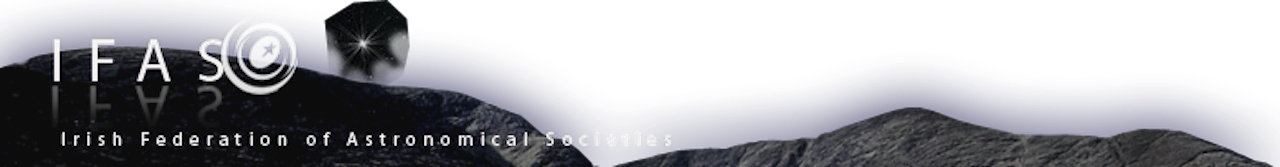
I think we need to get a new logo / brand identity for IFAS and www.irishastronomy.org following the points that Dpower laid out...surely there must be a graphic designer out there who is willing to take up the challenge. I thik the logos at the moment are a little lost and not strong enough.
I know that we already have a thread on redesigning logos but I feel that we should take advantage of the change in website design to go for it.
it is hard to organise with so many people giving their opinions etc., but should we set up a small temporary group to define what we need on the logo front, put a brief in place and see if we can get somebody to donate their services for free.
just my 2 cents
Cheers
Trevor
Please Log in or Create an account to join the conversation.
- voyager
- Topic Author
- Offline
- Super Giant
-
Less
More
- Posts: 3663
- Thank you received: 2
18 years 3 months ago #22073
by voyager
I'd have to say I agree with this. I'm a programmer not an artist and as such the Orion thing is the best I've been able to come up with. It's kinda cute and does technically fit DaveP's criteria but I think we can do better.
My Home Page - www.bartbusschots.ie
Replied by voyager on topic Re: Feedback wanted - Preliminary look at Version 3 of website
Nice Work Bart...Its looking super crisp, clean and professional, I have one or two comments though if you do not mind
I think we need to get a new logo / brand identity for IFAS and www.irishastronomy.org following the points that Dpower laid out...surely there must be a graphic designer out there who is willing to take up the challenge. I thik the logos at the moment are a little lost and not strong enough.
I know that we already have a thread on redesigning logos but I feel that we should take advantage of the change in website design to go for it.
it is hard to organise with so many people giving their opinions etc., but should we set up a small temporary group to define what we need on the logo front, put a brief in place and see if we can get somebody to donate their services for free.
just my 2 cents
I'd have to say I agree with this. I'm a programmer not an artist and as such the Orion thing is the best I've been able to come up with. It's kinda cute and does technically fit DaveP's criteria but I think we can do better.
My Home Page - www.bartbusschots.ie
Please Log in or Create an account to join the conversation.
- mjs
- Offline
- Main Sequence
-

Less
More
- Posts: 392
- Thank you received: 2
18 years 3 months ago #22074
by mjs
Michael Scully
Visit Kerry Astronomy Club
Replied by mjs on topic Re: Feedback wanted - Preliminary look at Version 3 of website
Small point, the orion on the right is mirrored left to right. I corrected it but cannot upload the PNG file format to you. So there is a (larger) jpg format at (removed see below)
Michael
Michael
Michael Scully
Visit Kerry Astronomy Club
Please Log in or Create an account to join the conversation.
- voyager
- Topic Author
- Offline
- Super Giant
-
Less
More
- Posts: 3663
- Thank you received: 2
18 years 3 months ago #22075
by voyager
It is intentionally mirrored so that that page is more symetric!
My Home Page - www.bartbusschots.ie
Replied by voyager on topic Re: Feedback wanted - Preliminary look at Version 3 of website
Small point, the orion on the right is mirrored left to right. I corrected it but cannot upload the PNG file format to you. So there is a (larger) jpg format at www.irishastronomy.org/user_resources/fi...ontentBackground.jpg
Michael
It is intentionally mirrored so that that page is more symetric!
My Home Page - www.bartbusschots.ie
Please Log in or Create an account to join the conversation.
- albertw
- Offline
- IFAS Secretary
-

Less
More
- Posts: 4173
- Thank you received: 181
18 years 3 months ago #22077
by albertw
And looks like its dancing")
Albert White MSc FRAS
Chairperson, International Dark Sky Association - Irish Section
www.darksky.ie/
Replied by albertw on topic Re: Feedback wanted - Preliminary look at Version 3 of website
It is intentionally mirrored so that that page is more symetric!
And looks like its dancing
Albert White MSc FRAS
Chairperson, International Dark Sky Association - Irish Section
www.darksky.ie/
Please Log in or Create an account to join the conversation.
Moderators: darragh
Time to create page: 0.113 seconds