
- Posts: 3663
- Thank you received: 2
Feedback wanted - Preliminary look at Version 3 of website
- voyager
- Topic Author
- Offline
- Super Giant
-

Less
More
18 years 3 months ago #22099
by voyager
Definitely, that's the brand of this site and always has been. Unless someone else can come up with a snappy name for the site that's the best brand we have.
Purple? It's all blue! Also, it's amazing what different people thing, I showed my better half the new look and he HATES the yellow!
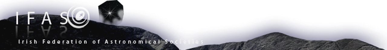
Well Orion is a constelation so that is the link to Astronomy and the stars are green, hence the link to Ireland. I'm open to better ideas but that's what my limmited imagination came up with!
Terrible as a logo. Does not work in black & white, does not work in print ...... basically it fails horribly on pretty much all of DaveP's criteria!
There are a lot of clubs! That would only work on a LARGE logo. Mind you I did have that in mind for a big map on the "clubs" page.
LMAO ... that's the 'Star Trek font' that others were so keen to see binned. I'm with you though, I like it!
Was going for the ancient irish look to show the LONG history or Astronomy in Ireland but I see your point.
Slowley slowley catchy monkey!
My Home Page - www.bartbusschots.ie
Replied by voyager on topic Re: Feedback wanted - Preliminary look at Version 3 of website
Thats much nicer Bart
I dont mean to be a pain but why is "irishastronomy.org" on the top of the page, maybe that should be "The home of Irish astronomy on the web".
Do you think it sould be there??
Definitely, that's the brand of this site and always has been. Unless someone else can come up with a snappy name for the site that's the best brand we have.
The yellow colour is bang on.
The jury however is out on the purple.
Purple? It's all blue! Also, it's amazing what different people thing, I showed my better half the new look and he HATES the yellow!
We really need a new logo. The orion logo has zippo to do with irish astronomy.
Well Orion is a constelation so that is the link to Astronomy and the stars are green, hence the link to Ireland. I'm open to better ideas but that's what my limmited imagination came up with!
Did people not like the crab nebula fading in and out of an outline of Ireland, with IFAS in the middle.
Terrible as a logo. Does not work in black & white, does not work in print ...... basically it fails horribly on pretty much all of DaveP's criteria!
If we were to go down that route, then have a 4 point star in the map for every location of a club in the country.
There are a lot of clubs! That would only work on a LARGE logo. Mind you I did have that in mind for a big map on the "clubs" page.
I really like the IFAS font on the upper left had side.
LMAO ... that's the 'Star Trek font' that others were so keen to see binned. I'm with you though, I like it!
Some might say that the font for " www.irishastronomy.org " could have astrological (such a dangerous word to use here :wink: ) connotations about it .
Was going for the ancient irish look to show the LONG history or Astronomy in Ireland but I see your point.
Anyway, I think we're heading in the right direction.
Good stuff Bart.
Slowley slowley catchy monkey!
My Home Page - www.bartbusschots.ie
Please Log in or Create an account to join the conversation.
- briano
- Offline
- Proto Star
-

Less
More
- Posts: 59
- Thank you received: 0
18 years 3 months ago #22104
by briano
Brian O Leary
Replied by briano on topic Re: Feedback wanted - Preliminary look at Version 3 of website
Great stuff Bart.I was just thinking about something else that could go on the page,"picture of the week", people would post their best pictures during the week and the winner would have their picture posted up in a small image on one of the sides.
It just an idea tell me what you think :idea:
It just an idea tell me what you think :idea:
Brian O Leary
Please Log in or Create an account to join the conversation.
- voyager
- Topic Author
- Offline
- Super Giant
-
Less
More
- Posts: 3663
- Thank you received: 2
18 years 3 months ago #22105
by voyager
I like it!
It's exactly those kinds of things that give a site a community feel rather than just being a static page that tells you stuff.
Anyhow, the next iteration is up there now for you're perusal. Most of the changes are quite subtle but IMO they really made a huge difference and we have now, for the first time, arrived at a design I am not ashamed to have associated with me!
Again, comments please!
My Home Page - www.bartbusschots.ie
Replied by voyager on topic Re: Feedback wanted - Preliminary look at Version 3 of website
Great stuff Bart.I was just thinking about something else that could go on the page,"picture of the week", people would post their best pictures during the week and the winner would have their picture posted up in a small image on one of the sides.
It just an idea tell me what you think :idea:
I like it!
It's exactly those kinds of things that give a site a community feel rather than just being a static page that tells you stuff.
Anyhow, the next iteration is up there now for you're perusal. Most of the changes are quite subtle but IMO they really made a huge difference and we have now, for the first time, arrived at a design I am not ashamed to have associated with me!
Again, comments please!
My Home Page - www.bartbusschots.ie
Please Log in or Create an account to join the conversation.
- albertw
- Offline
- IFAS Secretary
-

Less
More
- Posts: 4173
- Thank you received: 181
18 years 3 months ago #22106
by albertw
A logo and or font competition?")
I dont like the gothic irishastronomy.org font. The font for "Irish Federation..." looks fine.
Cheers,
~Al
Albert White MSc FRAS
Chairperson, International Dark Sky Association - Irish Section
www.darksky.ie/
Replied by albertw on topic Re: Feedback wanted - Preliminary look at Version 3 of website
Again, comments please!
A logo and or font competition?
I dont like the gothic irishastronomy.org font. The font for "Irish Federation..." looks fine.
Cheers,
~Al
Albert White MSc FRAS
Chairperson, International Dark Sky Association - Irish Section
www.darksky.ie/
Please Log in or Create an account to join the conversation.
- voyager
- Topic Author
- Offline
- Super Giant
-
Less
More
- Posts: 3663
- Thank you received: 2
18 years 3 months ago #22107
by voyager
That's not a Gothic font! I actually really like it, it has character without being totally OTT like the otherones we tried.
For the site I'm happy to go with my Orion thing since that is a common theme for the whole look but I do NOT think it should become our logo. What ever logo we have should be added to the site where the IFAS text is now on the top right of the page.
If we're gonna run a competition will we be offering anything more for a prise than our eternal gratitude?
BB
My Home Page - www.bartbusschots.ie
Replied by voyager on topic Re: Feedback wanted - Preliminary look at Version 3 of website
Again, comments please!
A logo and or font competition?
I dont like the gothic irishastronomy.org font. The font for "Irish Federation..." looks fine.
Cheers,
~Al
That's not a Gothic font! I actually really like it, it has character without being totally OTT like the otherones we tried.
For the site I'm happy to go with my Orion thing since that is a common theme for the whole look but I do NOT think it should become our logo. What ever logo we have should be added to the site where the IFAS text is now on the top right of the page.
If we're gonna run a competition will we be offering anything more for a prise than our eternal gratitude?
BB
My Home Page - www.bartbusschots.ie
Please Log in or Create an account to join the conversation.
- dave_lillis
- Offline
- Super Giant
-
18 years 3 months ago #22108
by dave_lillis
Dave L. on facebook , See my images in flickr
Chairman. Shannonside Astronomy Club (Limerick)
Carrying around my 20" obsession is going to kill me,
but what a way to go.")
+ 12"LX200, MK67, Meade2045, 4"refractor
Replied by dave_lillis on topic Re: Feedback wanted - Preliminary look at Version 3 of website
Now that I look at it again, it does look more bluish :lol:
The startrek font is good, just have it in moderation, as in, where the example site has it now.
In the right hand plane where it says you're logged in, would it be possilbe to have "View posts since last visit", or have it somewhere obvious on the front page?
The startrek font is good, just have it in moderation, as in, where the example site has it now.
In the right hand plane where it says you're logged in, would it be possilbe to have "View posts since last visit", or have it somewhere obvious on the front page?
Dave L. on facebook , See my images in flickr
Chairman. Shannonside Astronomy Club (Limerick)
Carrying around my 20" obsession is going to kill me,
but what a way to go.
+ 12"LX200, MK67, Meade2045, 4"refractor
Please Log in or Create an account to join the conversation.
Moderators: darragh
Time to create page: 0.116 seconds